RSPCA
Redesigned RSPCA Australia’s KnowledgeBase
Year
2025
Timeline
7 Weeks
Category
NGO
Service
UX Design
Goal
The RSPCA is Australia’s leading animal welfare charity. However, their Knowledge Base (KB) functioned more as a static archive than a dynamic resource. The mission was to transform this "encyclopedia" into a user-centric digital ecosystem that empowers pet owners and animal lovers with actionable, trustworthy advice.
Result
I have organized the necessary redesign features into three critical focus areas: - Authority Building trust by including the About Author Card and a Fact-Checked Label on articles. - Navigation Ensuring effortless exploration with Filter/Sort By options, a Floating "Top" Button for long articles, and Side-by-Side Nav to clearly connect the KB and the main site. - Seamless Discovery Driving deeper engagement through AI Summaries, Interactive Quizzes, and a Newsletter Subscription option.
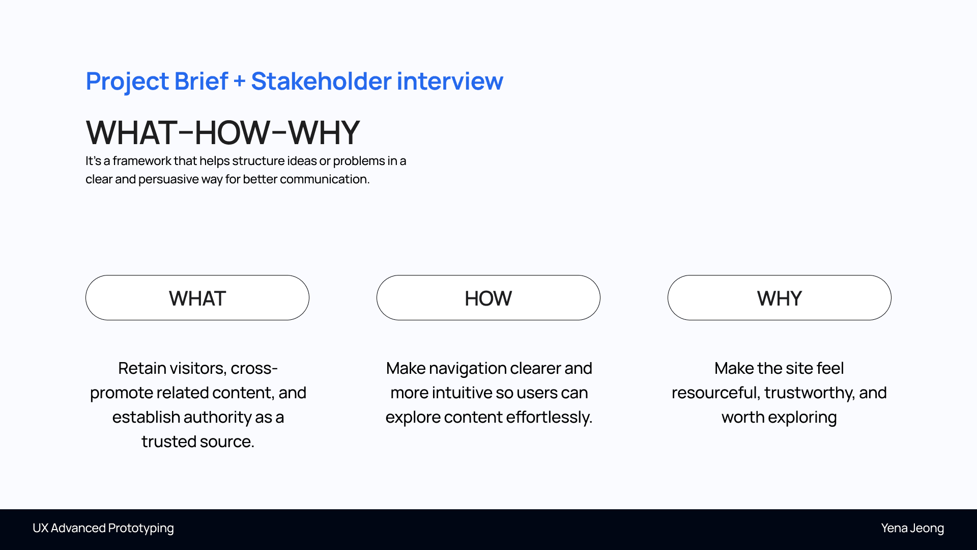
Strategic Reframing (The "What-How-Why")
Instead of a simple UI update, I started by reframing the project's core purpose: - What: Establish RSPCA as the leading, authoritative source of truth. - How: Through intuitive navigation and guided visual storytelling. - Why: To build a platform that users feel is "worth exploring" and inherently "trustworthy."
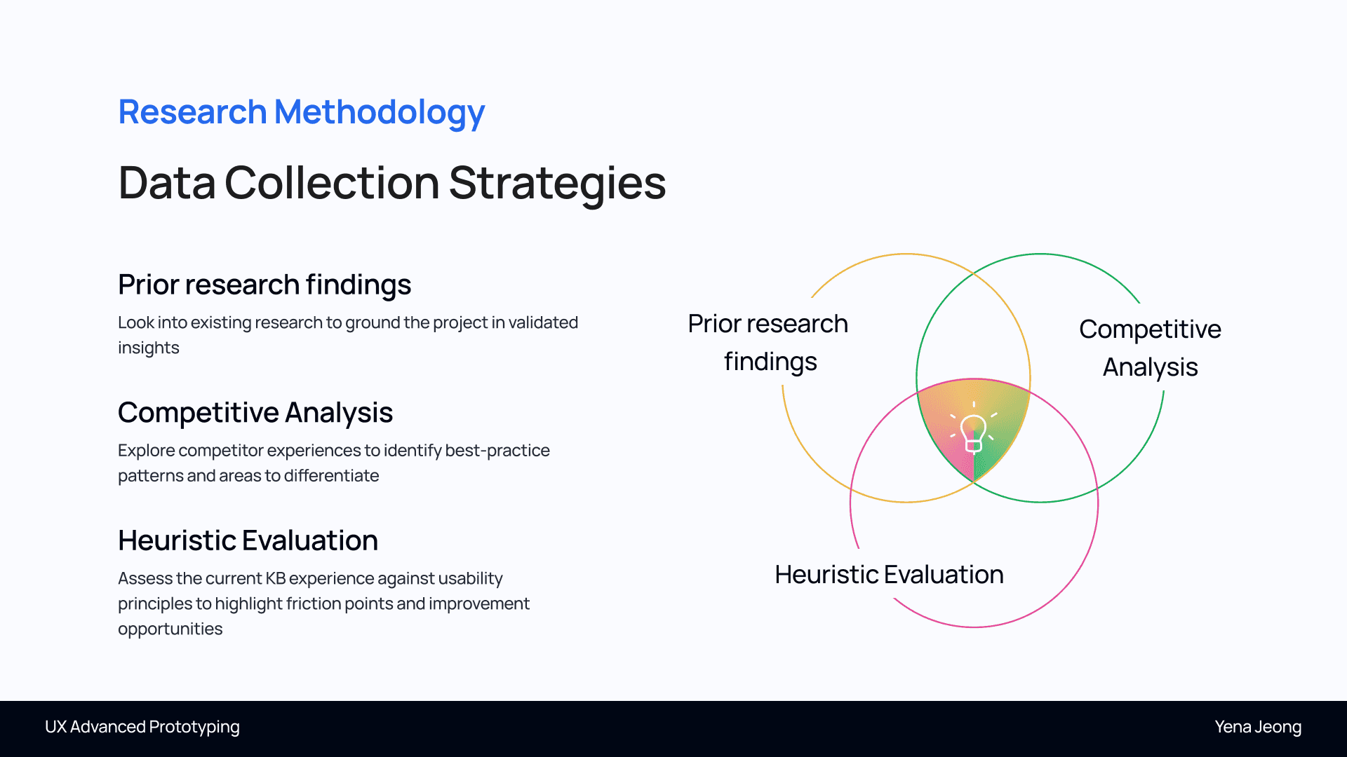
Market Research & Competitor Benchmarking
I analyzed the current landscape of animal welfare platforms. - Insight: Many sites (like World Animal Protection) focus on active campaigning, while others (like Animal Welfare Toolbox) focus on raw data. - Opportunity: I identified a gap for a "Hybrid Hub" that combines high-level authority with a friendly, consumer-facing UX.
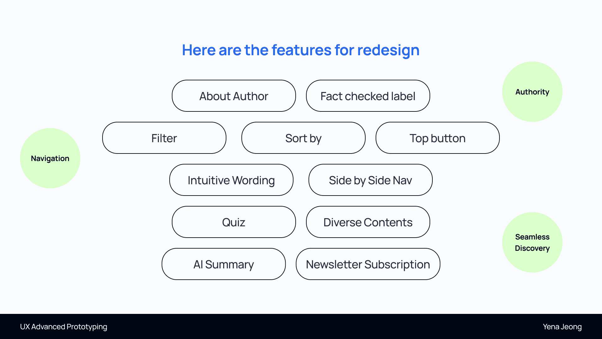
Defining the "Three Lenses" (Design Principles)
To guide the redesign, I established three fundamental pillars: - Authority: Showing expertise through verified labels and author credentials. - Navigation: Ensuring the user never feels lost, regardless of the device. - Seamless Discovery: Encouraging "Information Grazing" where users naturally move from one topic to the next.

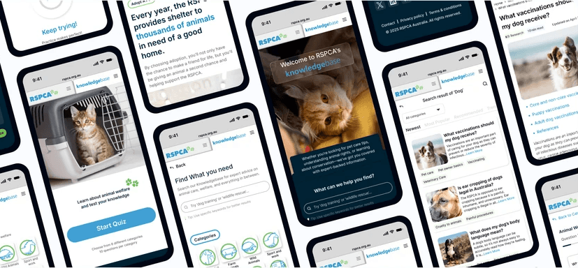
Home & Navigation
- Folder/Tab-Style Menu: Implemented a dual-navigation system for seamless switching between the main RSPCA site and the Knowledge Base. - Clear Introduction: Added a distinct KB introduction and kept the search function visible for instant utility.

Information Architecture (IA) Overhaul
I restructured the content hierarchy to prioritize Scannability. - Outcome: Implemented an icon-based grid system for the homepage and a clear "Document Type" tagging system (Video, Article, PDF). - Impact: This allows users to filter content based on their preferred learning style and urgency.

Advanced Drop-Down Menu
- Accessibility: Ensured the search page can be accessed from any point in the user journey. - Engagement Hooks: Integrated the Quiz feature and links to the Adoption page directly within the navigation to drive user action.

Optimized Search & Filtering
- Customisable Category View: Users can now sort results by "Newest," "Most Popular," or "Recommended" based on their personal priorities. - Downloadable Documents: Included visual previews of PDF reports so users understand the format and content before downloading.

Article Scannability
- Quick Access: Added clickable table of contents for direct navigation within long-form articles. - AI-Generated Summaries: Introduced short AI summaries and a floating "Top" button to significantly improve scannability on mobile devices.

Building Trust & Engagement, Gamified Learning & Future Impact
Mentor evaluation
Mentor evaluations highlighted my strengths in Synthesis, Resourcefulness, Presentation, and Empathy, reflecting Midweight-level design capabilities.


