Food Education Australia
Good causes lose donors at the first click. Food Education Australia's website struggled to clearly communicate its mission, impact, and value — and that struggle was showing up directly in low engagement and donation conversion. Users couldn't quickly grasp the organization's purpose, found key information hard to navigate, and rarely felt emotionally connected enough to act.
Duration
Mar-Jun, 2025
Client
FEA
Services
#
Product Design
#
Prototype
#
UX Research

Challenge
FEA was shifting toward a grassroots, community-driven model — targeting middle- and low-income donors through transparent, impact-led storytelling. The challenge was to redesign the digital experience around trust, emotional connection, and clarity, without losing sight of the core business goal: donations.
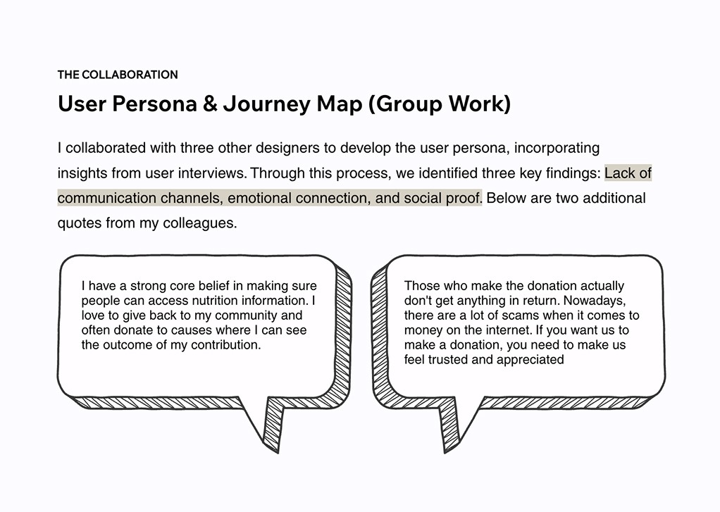
User interviews surfaced three consistent barriers: no real two-way communication channel, a digital experience that felt faceless and emotionally flat, and a social proof deficit that made users hesitate before giving. A journey map built from real interview data pinpointed exactly where trust broke down — a sharp mood drop during the communication phase, driven by cluttered information and no visibility into real-world impact.
Three opportunities fell out of this: converting skeptics through live transparency tools, reducing friction with verified social proof, and building retention through personalized impact receipts that make donors feel valued, not just processed.



Solution
Four design priorities shaped the work, each targeting a specific point of drop-off.
Navigation users can scan, not study — the site structure was simplified and a visual-first approach prioritised video and imagery over dense text, built for time-constrained users who need to understand FEA's value in seconds.
Credibility shown, not just claimed — clear breakdowns of how donations are used, a dedicated section for certifications and organisational history, and an FAQ that proactively addresses doubts users were too hesitant to voice.
A donation flow with nothing in the way — flexible giving options including subscriptions and automatic payments, paired with personalised confirmation receipts that turn a transactional moment into genuine recognition.
Built for the long game — newsletters, shareable digital flyers, and a continuous feedback loop to keep supporters engaged well beyond the first donation.
These priorities came together in a high-fidelity Figma landing page. A fixed donate button stayed accessible at all times. A dedicated section highlighted FEA's work with children alongside real-time activity to build emotional connection. A weekly recipe-sharing feature gave visitors a reason to return without asking for money.
Usability testing with four women aged 30–50 confirmed the trust-building elements worked — and surfaced three refinements: stronger urgency around the food education deficit, less text density, and improved color contrast for users scanning quickly. The final design extended FEA's existing brand colors into a playful yet professional visual identity, with every page structured to balance warmth with functionality.


Impact
Mentor evaluation recognized strong performance in discovery, resourcefulness, agile ways of working, and UI design — reflecting capability at a Midweight Designer level.
This project surfaced something I hadn't fully appreciated before: communicating the value of a non-profit is genuinely hard. Keeping someone engaged long enough to act takes more than accurate information — it takes storytelling people actually feel. It was a difficult project, but a genuinely enjoyable one, and it pushed me to think more carefully about designing for empathy, engagement, and purpose all at once.